Usability testing
Streamlining event registration for the whimsical archive of a town's history.
Client
The History Center of
Lake Forest - Lake Bluff, Illinois
ROLE
UX Designer
EXPERTISE
TimeLine
4 Weeks

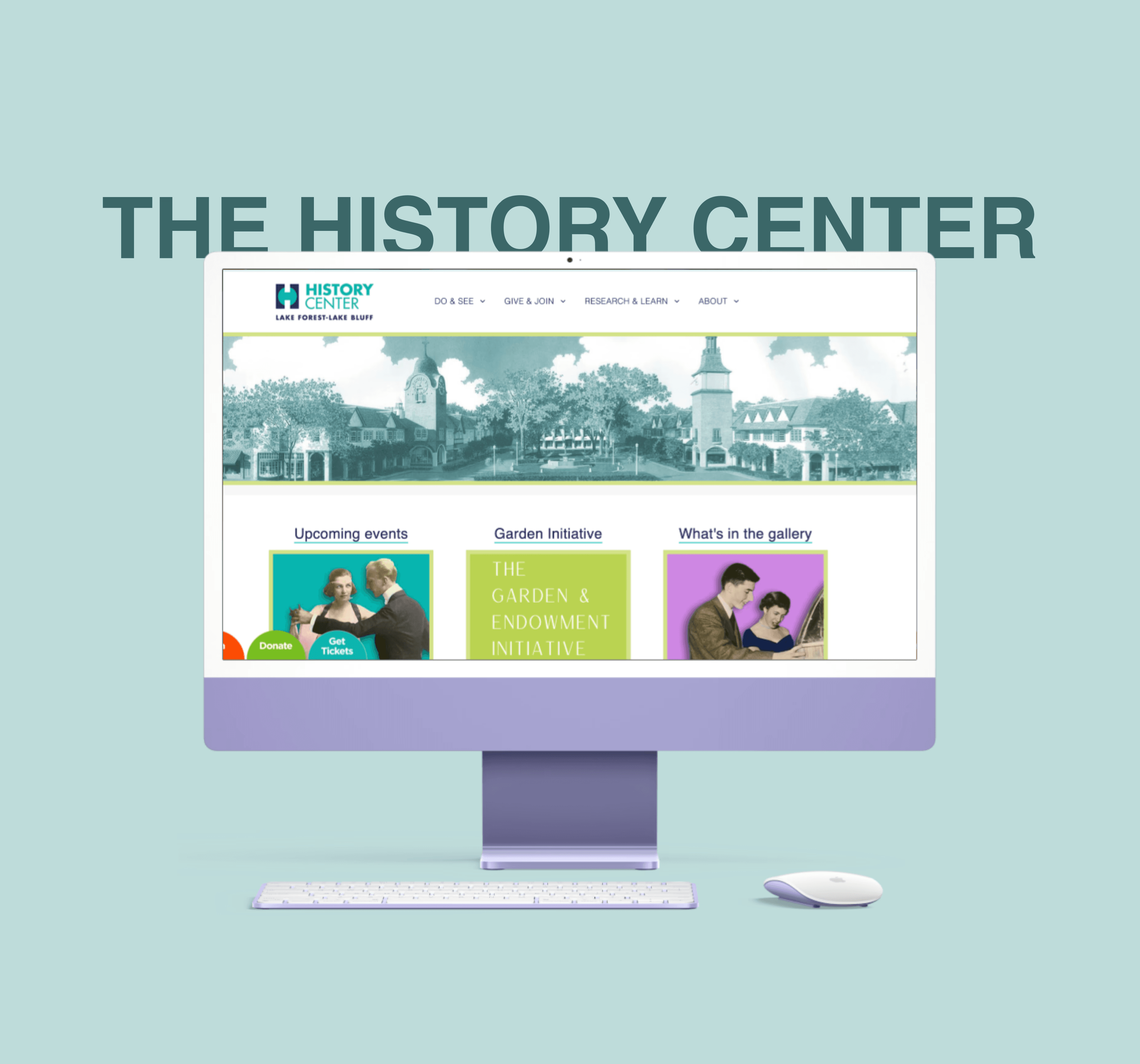
A lot of small towns have an interesting history, and this website is a great display of it.
Users have described it as "Whimsical", "Informative", and "Organized". But are visuals and language enough to make a seamless digital experience?
Is the History Center's website as usable as it's charming?
The History Centers website hosts so much information about the town's past. There's lots of eye-catching visuals and vocabulary which surely help attract visitors not only to the website, but also to the museum. However, there's a few usability quirks which could leave a tiny mark on the users experience.
This is how most users went when testing:
😁 -> 😃 -> 🤔 -> 😊
So what are their pain-points?
Users found the events section of the site to be slightly redundant, with steps that aren't necessary. They felt that the events page isn't as well organized as the rest of the site.
"I'm not motivated to RSVP. Why is it taking me through so many steps to learn about it and register? Like… there's nothing in this page that would draw me in, you know?"
They were also confused with the way recurring events were laid out, unsure if it was 2 different events or the same one on multiple days.
"… Are these meant to be seperate events? Why are there 2 of the same thing?"
Current "Events" page

So how'd we use our superpowers?… tadaaa…
Re-organized events page
See the earliest upcoming event first, and the rest get organized below.
An Informative Calendar
We wanted to enable users plan their visits more effectively. SO we introduced a calendar, with little dots under the dates of events (and a preview of events in further upcoming months)
An accessible RSVP button
The lets users skip needing to go into the event page in order to register, encouraging registrations more.
Event description to draw people in
Earlier, the only information users had about an event was the flyer, and date - unless they clicked into red more. But what would draw them in to read more?… and event description.

Let's take a closer look. What were the issues with the existing events page?

Here's how we addressed it…


But wait… there's a bonus find!
During testing, we found another rather agonizing bug. The event banner on the home page was not clickable.

"I look at this and I'm so drawn to it. It's so whimsical. Why is it not clickable??"
This particular issue was resolved soon after notifying the client about it.
This project was a first in many ways. But we shined.
It was my first time being part of an opinionated team, my first time dealing with an uncertain client, and my first time understanding and implementing what UX truly is.
The client was very pleased with each of our solutions, and the team. He plans on implementing all of it as soon as he gathers funding for it.